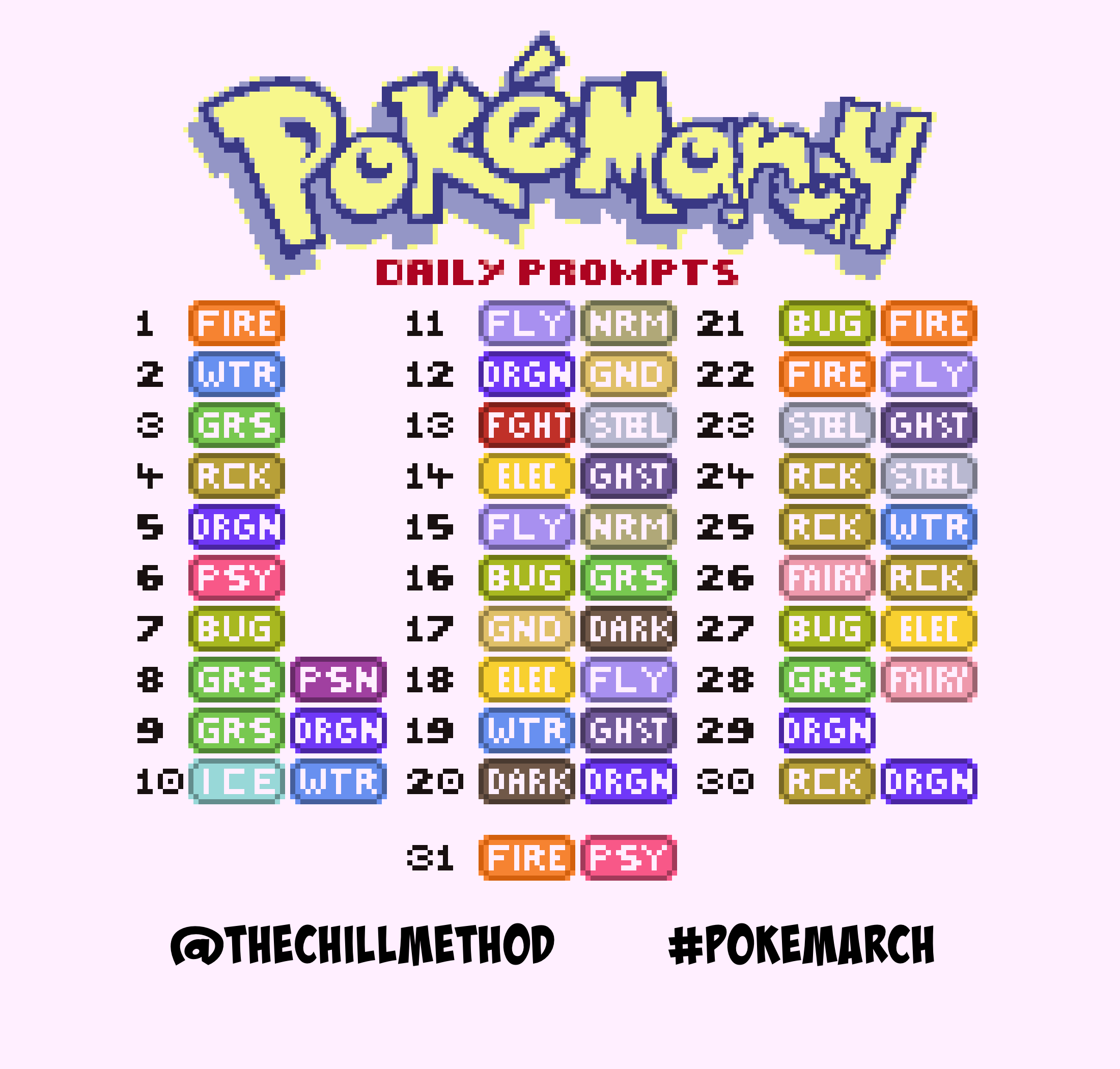
f7.png

Pokemarch

pokemarch prompts bigger.png

PokéMarch

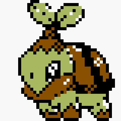
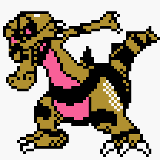
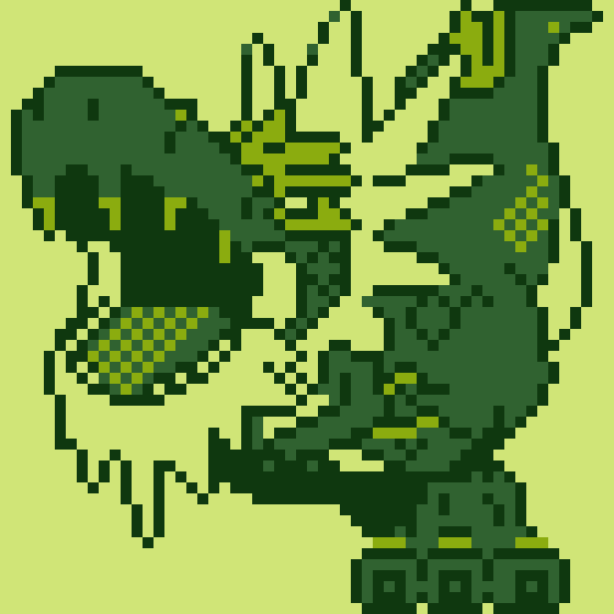
In previous years, I would have called the pixel art challenge march of the pixels, but with this year being pokemon’s 25th anniversary, and me always wondering if I could better understand the sprite work in classic pokemon games, it just felt right to theme it this way. The following images are attempts at making pokemon not present in generation 2 (gold, silver, and crystal) fit within the limitations of a classic sprite of that era. This also means that you can probably mod them into the game if you feel so inclined to do so. For me though, it was more about seeing what was possible with the limits.

What are the limits of a classic generation 2 sprite?

  1. Sprites were formed by 8x8 tile grids

  2. Sprite sizes were 40x40, 48x48, and 56x56 pixels respectively

  3. Sprites could technically use 3 colours, but in actuality only used 2 since one colour was always black for the “linework”

  4. Yes, there is a fourth tone, but it is always just the transparency of the screen base colour.

  5. I can’t use just any colour either, the Gameboy Color had a 15-bit palette, and all colours you will see are limited to that palette.

Day One: TEPIG/ ポカブ

01. tepig big green.png
01. tepig big.png

Tepig/ Pokabu is starter from what is still my favourite pokemon generation. There was something about gen 5 that just really grabbed me as a person that hadn't really been grabbed by since gen 2. I'm currently playing a title from every pokemon gen this year, and I am curious as to whether my love for generation 5 has stood the test of time.


DAY TWO: MUDKIP/ ミズゴロウ

02. mudkip big.png
02. mudkip big green.png

Mudkip/ Mizugorou is a pokemon that I vaguely remember getting a bit of “stick” from the more long time members of the fanbase. Personally I haven’t played gen 3, it’s the only gen I haven’t played other than 8, and the only reason I haven’t played gen 8 is because I wanted to go through each generation in order again before hand (which is taking a while at my pace) I’m finding my generation play order has gone a bit “tarantino” though because of a want to play the rereleases over the originals, while still having an order of sorts.


DAY THREE: TURTWIG/ ナエトル

03. turtwig big green.png
03. turtwig big.png

Turtwig or Naetle/Naetoru is part of a gen I remember being a bit of a strange time for pokemon. I don’t know if anybody knew that generation 4 would see another four generations following it. That said I like the bits I seem to remember, such as a pretty good use of a second screen as well as a slightly different look of 2d sprites in a 3d world.


DAY FOUR: NOSEPASS/ ノズパス

04. nosepass big.png
04. nosepass big green.png

You know, I used to be confused as to why the generation 3 sprite was so different to how he was drawn, and this hasn’t helped. I can only imagine that the sprite was part of an earlier concept that they just didn’t feel the need to change? Either way this is Nosepass, a pokemon that I actually like the design of a lot. I think along with a lot of generation 3 though, that it got a lot of hate at the time because a lot of fans didn’t clock on that pokemon designs have always been a bit “out there” I mean… just look at Tangela, Porygon, or Sudowoodo.


DAY FIVE: AXEW/ キバゴ

05. axew big green.png
05. axew big.png

I can remember being so excited for generation 5 that I started watching the anime again in anticipation of its release. Kibago was what I first knew Axew as, and although I get why names have to change, it was genuinely more jarring to know them as one before the other. It's a form of localisation that I think works though, like how the word for almost all animals changes depending on your language in the real world too.


DAY SIX: MUNNA/ ムンナ

06. munna big.png
06. munna big green.png

Munna is another pokemon that without katakana, pretty much just has the exact same name, and I think the reason is because of their name being somewhat based in latin as well as japanese. Either way, there's something appealing about a floating trunky chonk monster that I love. It's another generation 5 design too... it's almost like i'm obsessed with gen 5 or something!


DAY SEVEN: BLIPBUG/ サッチムシ

07. blipbug big green.png
07. blipbug big.png

I'm currently playing through every pokemon generation this year, all in the efforts to go all the way to generation 8 and see just how much things have changed since gen 1. The one thing I've found is that the new designs after a while blend in with the old ones really well, and Blipbug to me is a perfect example of this. His japanese name is SacchiMushi, both names are inferring that this bug has some kind of radar function, but the japanese name seems to also infer wisdom, hence the design looking like the pokemon is kind of wearing glasses.


DAY EIGHT: FOONGUS/ タマゲタケ

08. foongus big.png
08. foongus big green.png

I feel like generation 5 just has so many great pokemon to convert into classic sprites. Foongus to me is weirdly appealing. I can't quite explain it, but even their basic silhouette just looks so appealing. Their Japanese name is a different play on words to ours though, where as our name is fool and fungus, the Japanese name Tamagetake is a "surprising" or "Astonishing" mushroom. Also thanks to how simple their design also is, I had time enough to play around with different poses more before settling on this one.


DAY NINE: FLAPPLE/ アップリュー

09. Flapple big green.png
09. Flapple big.png

I think this was the first sprite where I really had to rethink how to display visual information, because Flapple needs so much information to display correctly. He needs the extra tone/ colour for one (possibly two extra colours or shades), because he has a design that otherwise looks flat within the limitations of the gen 2 cart specs. The Japanese name for this one is Appryu, and this name makes a lot more sense than the english version (literally apple and dragon). I think if I'd been a part of localisation, the first name to come out of the bag would be Drapple which unless it has unwanted double meanings, seems to work better... possibly. I don't like inferring I have a "better" idea than development teams, because usually a lot more than what we see on the surface has happened for the team to reach that decision.


DAY TEN: SPHEAL/ タマザラシ

10. spheal big.png
10. spheal big green.png

Whenever I do a Generation 3 Pokemon, I'm reminded that I really need to hurry up with gen 2's run as I've never actually played Gen 3 at all. I think once I do get into gen 3 I'm probably going to go with sapphire. I can't quite explain it, but I'm mysteriously drawn to that version in particular. The sprite itself is probably the easiest one of them all to do, as despite using clip studio paint, crafting a perfect circular form in any digital art program is extremely easy to do, so much so that I wanted to at least draw him tilting into a pose just to keep thing a bit more interesting. As has become the custom, this Pokemon's Japanese name is Tamazarashi which is definitely more of a mouthful, but is pretty one to one with our translation, even in the order that the portmanteau is in is the same.


DAY ELEVEN: STARAPTOR/ ムクホーク

11. staraptor big green.png
11. staraptor big.png

Man, we are now officially over the first third of the art challenge now! This is partly down to the limits, but whenever I tried to make this mon look a little leaner (even by shifting pixels by one) to match its artwork better it started to look too thin, so I went with this compromise. MukuHo-ku or Mukuhawk is a slightly different play on words for the pokemon, it's just grey starling and hawk put together instead.

I don't remember generation 4 as well as I probably should. I remember swimming being really really slow in it though, which took the wind out of my sails a bit (no pun intended). I hear that got fixed in the platinum version of the generation though, so here's hoping they keep movement speed up in the upcoming remake, as exploration in a game with random encounters can start to really feel like a slog when you're just chipping away at the unexplored map.


DAY TWELVE: GABITE/ ガバイト

12. Gabite big.png
12. Gabite big green.png

We're now at the stage where a lot of upcoming pokemon are just going to be much harder to render within the limits given. I'm also trying to at least use poses that already exist as reference because there's just a lot that can already go wrong with pieces that I only have a day to do. Gabite is another gen4 pokemon, and is one I actually remember not really liking that much originally. I then read up about it, and it seems pretty handy to have in a party maybe? I think my original issue was its design being a bit too busy, but it's not like it's bad or anything. Either way, if Gabite is a favourite of yours, more power to you, and I hope I did it some gen2 justice!

(Their Japanese name is no different this time, so no obligatory comment for consistency here)


DAY THIRTEEN: LUCARIO/ ルカリオ

13. Lucario big green.png
13. Lucario big.png

I went into this one feeling like I had some advantage with the limitations, but due to sprite size limits, it's actually still tricky to make sure his pose reads well. When it comes to the sprite sizes, the absolute maximum is 56x56 and I have made the decision to only reserve that size for things that are genuinely huge in size. For pokemon like Lucario where they sit in the middle, the sprite size is 48x48 and for pokemon smaller I make sure they use the 40x40 template, all of which were genuinely used in gen 2 which at least makes sure they don't look too out of place next to the original designs.

Lucario is another pokemon that has the same name in both english and japanese, which combines a kind of metal and the word for wolf as far as I can tell. The name origin is a bit less well defined than some pokemon names, and I couldn't seem to find any source that confirmed this beyond a fairly strong and well reasoned assumption.


DAY FOURTEEN: ROTOM/ ロトム

14. rotom big.png
14. rotom big green.png

I weirdly always used to forget about this pokemon's existence up until sun and moon where you literally can't for story reasons. There's something about it that seems to fall into the back of my mind as far as pokemon go, yet their design is completely fine, not a single problem in my mind exists with them. In fact I think it's super cool that a pokemon has the power to integrate with technology in ways that changes it's type and form. Their Japanese name is yet again unchanged, and literally is just "Motor" spelled backwards. I seem to be going through a string of pokemon who haven't had their name localised lately!


DAY FIFTEEN: RUFFLET/ ワシボン

15. rufflet big green.png
15. rufflet big.png

It's the eagle boy himself, also known to Japan as Washibon which literally means just that, eagle boy. Personally, I went into this one thinking it'd be easier than it was, but Rufflet has a lot of sneaky minor details that I think are really easy to miss without trying to pick and choose what can be lost and kept. We're kind of on top of the half way point now! I'm kind of excited for what's to come next, as it starts getting a bit more interesting this week.


DAY SIXTEEN: LEAVANNY/ ハハコモリ

16. leavanny big.png
16. leavanny big green.png

I really enjoyed this one. I decided that I was going to really push the gesture on this since they have an already dynamic form. In the end I went with this pose which I was genuinely surprised to see come out as well as it did in pixel art form. The biggest thing that's helping me is the figure ruler and hand drawn ruler in Clip Studio, because you can essentially create non-pixelated lines to draw with and then use the grid to convert that drawing faster with less trial and error.

Their Japanese name is Hahakomori, which like the assumed meaning of Leavanny being "leaf nanny" is a play on the words leaf, mother, and baby sitter, which kind of brings you to almost the same place in both cases meaning wise. I've also heard rumours that Leavanny is possibly referencing the Roman goddess Levana, which mainly seems plausible because she is the goddess of newborn babies.


DAY SEVENTEEN: KROKOROK/ ワルビル

17. krokorok big green.png
17. krokorok big.png

Dabbing might be a bit old fashioned now, but it's ahead of this Mon's time that's for sure! Also as soon as I got the idea to make him dab, that was this Pokemon sprite decided. I can't remember type advantages very well, but I think this Pokemon is possibly pretty decent for a 6 Mon team? Either way I've always appreciated how it looks design wise, as I'm a major fan of simple but effective designs, which is possibly another reason why i'm a big fan of gen5.

The Japanese name for this one is Waruvile, which I think is one of those names where I'm undecided on how much localisation was really needed since the west is now pretty familiar with Japanese characters using the word Warui (Wario and Waluigi) and vile is also extremely serviceable. It's definitely one of the easier Japanese names to understand at face value anyway.


DAY EIGHTEEN: EMOLGA/ エモンガ

18. emolga big.png
18. emolga big green.png

We kind of have to talk about Emolga's name right away for this one, as the Japanese name is "Emonga" and from what I found when digging, Emolga is just a really weird choice all around. I think the best explanation is that it could have sounded like an english slur, but I'm not 100% sure that's the reason why. It's not a translation error either, as the strokes for RU and N are totally different from one another. Maybe the people working in localisation (maybe a person) was having an off day? Your guess is a good as mine on this one!


DAY NINETEEN: JELLICENT/ ブルンゲル

19. jellicent big f green.png
19. jellicent big f.png
19. jellicent big.png
19. jellicent big green.png

Jellicent has both a female and male form, and it felt wrong to choose between one or the other, so I decided the absolute best thing to do was to do both forms for this entry. This is kind of a common issue with this sprite size, but even with eyes as large as this, sacrifices still had to be made in both designs. It's crazy how gen 5 was still very clearly using sprites, but the fidelity of them was just much higher than it used to be. A max gen5 sprite size is just shy of being double this sprite size, and though that may not seem like a lot, it makes a huge difference.

The Japanese name for this Pokemon is Burungel which takes jellyfish and angel and puts them together, and the English name is just jellyfish and translucent. I think Balloongel could have worked too though, and even has the merit of sounding similar despite meaning different, but that's already the case with Jellicent anyway, so I don't think the difference in meaning really means all that much.


DAY TWENTY: DEINO/ モノズ

20. deino big green.png
20. deino big.png

I have a huge feeling of regret for this one. Deino's design is simple, but because of his colours, things become very visually unclear if given his standard pose. There's loads of scrapped poses for this that will remain unseen for now, including one where he's doing a play bow. Then I decided to go with a kind of crying out to the sky pose, which in all honesty, may have been me expressing those frustrations visually through this Pokemon.

This Pokemon's Japanese name is Monozu which means "one head" and its English name can mean a whole lot more than that, Some people in the fan community think it translates as "one dinosaur" with the EIN part of it's name. Other fans are more inclined to simply compare it to dinosaur names in general such as the Deinosuchus or Deinonychus. Regardless, I don't feel like either of the names grab me much. I find this Mon's design interesting, but the name in both languages is a bit too middle of the road and forgettable.


DAY TWENTY-ONE: VOLCARONA/ ウルガモス

21. volcarona big.png
21. volcarona big green.png

It's definitely really satisfying when I get something like this as a result. Volcarona Is a personal favourite Pokemon design of mine, mainly because there's something I find inherently appealing about firey bugs... I tried to think of a way to explain it without the vagueness i'm currently presenting, but something about it just really works on various levels. Then there's the obvious great shape design in all directions that makes this Pokemon great too.

Volcarona is known as Ulgamoth in japan, which is another one of those names that kind of works better than what we got in terms of how this Pokemon is meant to be seen by the player. Ulgamoth takes its name from the Roman sun god Vulcan, and the word moth. Also there's only 10 more pokemon to go now! man how time has flown by!


DAY TWENTY-TWO: FLETCHINDER/ ヒノヤコマ

22. fletchinder big green.png
22. fletchinder big.png

As much as I will go on about the limits of gen2 when it came to how much had to be squeezed into very uniform rules, I'm genuinely glad that this is no longer the case for Pokemon as a franchise. Limitations definitely do breed creativity, but these Pokemon start to lose something really important in their designs that the better hardware could give them. For instance here, no matter what pose I put Fletchinder in, the lower fidelity and colour just reduced a lot of the impact the drawn design has.

The Japanese name Hinoyakoma pretty much means fire robin, or robin of fire, but not quite as they kind of throw in the word arrow between the two as well which is likely why the tail is the way it is.


DAY TWENTY-THREE: HONEDGE/ ヒトツキ

23. honedge big.png
23. honedge big green.png

I feel like if these Pokemon had existed in gen 2, their designs would have been slightly altered to fit in more. If i'm convinced of one thing, it's that I'm fairly sure the reason future gen Pokemon look so different to the earliest batch, is simply down to the necessity of fitting a design limit. That said I'm genuinely happy with how Honedge turned out all things considered.

The Japanese name is Hitotsuki, and is to do with being a singular stab or lunge, which makes sense considering it evolves into two swords with a name to represent that change too. It's pretty much the same as the English name, just that the English name adds in the act of polishing or sharpening the blade in addition to being one sharp object.


DAY TWENTY-FOUR: STAKATAKA/ ツンデツンデ

24. stakataka big green.png
24. stakataka big.png

I think if I were to have more time for each one of the trickier Pokemon such as this one, I'd find more extreme angles and poses that the limited amount of pixels can be used for in order to get more bang for their buck. This is at the max resolution a gameboy sprite can be, and it just isn't enough to faithfully recreate its original artwork with.

This Pokemon's Japanese name is Tundetunde which derives from tsunde, which means to be stacked. This is definitely one of the more "out there" pokemon designs that I think some fans may be turned off by, but I do kind of like how it looks a bit like a brick built version of one of the guardian's from Legend of Zelda BOTW.


DAY TWENTY-FIVE: CARRACOSTA/ アバゴーラ

25. Carracosta big.png
25. Carracosta big green.png

Carracosta is essentially using a pixel art trick that is more commonly found in the card art of the Gameboy version of the Pokemon trading card game. That transparent area of definition around his left hanging fin was something I felt was necessary to make sure that area of his body wasn't too noisy with how many things cross in that area. In fact, on that note, I highly recommend people check out the card art in Pokemon trading card game for Gameboy colour, as the level of detail and faithfulness to the real life counterparts is insanely good. I feel like it's especially impressive to look at if you have a relatively firm understanding of pixel art and how all sorts of techniques can be used to achieve some really impressive effects with very little at hand.

Carracosta's Japanese name is Abagoura, which seems to be a combination of three words; Abareru (To be violent) Abara (ribcage) and Kora (shell) but I've never seen any official confirmation of why the words are in such a combination, which seems to become more common in pokemon names the more recent they are. Carracosta's name of course is much more focused on him being a shelled coastal animal, though there is a hint of Carrara fossil formation too.


DAY TWENTY-SIX: CARBINK/ メレシー

26. carbink big 2 green.png
26. carbink big 2.png

Carbink is possibly one of my favourite name localisations for matching the design and type so well, and it's Japanese name Melecie is a mix of the word for rarity and small cut diamonds, which works really well too. It's always nice when a Pokemon's name works on both ends.


DAY TWENTY-SEVEN: CHARJABUG/ デンヂムシ

27. charjabug big.png
27. charjabug big green.png

I really enjoyed making this, after all sorts of weird and wonderful designs, I'm not ashamed to admit that I welcomed a very plainly geometric Pokemon design to just have fun with. Charjabug doesn't even suffer too much with the limits on tone that each sprite conforms to. I used to always capture bug types in each gen and regretfully replace them later on, and nowadays, I just send them straight to the PC or avoid them entirely, which is a genuine shame, as I feel like all types deserve to be pretty viable, it's just bugs always feel like a liability in most normal situations.

Charjabug's Japanese name is Dendimushi which is to say "Battery Bug". Honestly whenever I see this Pokemon I see a bus, I don't see the battery very clearly in its design at all. If you showed me one of those terrible security picture things that asks you to identify every square with a bus, this sucker gets clicked every time, and avoided for any pictures asking for me to identify a battery.


DAY TWENTY-EIGHT: SHIINOTIC/ マシェード

28. shiinotic big green.png
28. shiinotic big.png

Sometimes I see a Pokemon, and I know just how I want to pose them. This was one of those, where I knew I wanted to put more emphasis on just how hard to get around it is with a head that big. Imagine essentially having a massive hat on your scalp that you can't remove, also I know I could probably list off even less practical Pokemon designs, but this one seems to be the one where I start to ask these questions. This is possibly because the design tries to ground itself more in reality, so it's harder to remove logic from the fantasy.

Its Japanese name is Mashade, which is supposed to be mushroom and shade. Spelt with a Ma sound because of how the vowels are pronounced as well as Ma being a way of emphasising something dark or demonic when placed in front of another word. Another one of those names that works differently to ours which specifies a shiitake mushroom with hypnosis.


DAY TWENTY-NINE: REGIDRAGO/ レジドラゴ

29. regidrago big.png
29. regidrago big green.png

Only just started playing generation 8, so I don't know too much about this Pokemon, but it appears to be a continuation of the legendary line that was in generation 3. The way to get it is probably like a modern version of that too, or something embedded into the wild lands or something. Big fan of its design though.

Its name is the same for both Japanese and English too, and the Regi could possibly be short for Regis? I'm honestly not too sure about that though, as I guess it could also just be a Pokemon that registers or conforms to whatever type is in the name. Either way, really fun design, especially for the colour version of the sprite.


DAY THIRTY: TYRANTRUM/ ガチゴラス

30. tyrantrum big green.png
30. tyrantrum big.png

I really wanted to do one last really big pokemon before the end. I picked what I would have to have made for each day back in february, and this was partly to have enough time to really think about how to practically manage each Pokemon's design within the size limits. After everything I'd experienced with even the seemingly smaller "simpler" designs, I quickly figured that I'd have to really force perspective to make a larger Pokemon really work. In that respect, I'm actually really happy with the result.

The Japanese name for this one emphasises the large jawline, and serious size of the Mon, which when your type is Rock and Dragon, seems like a pretty sensible name to give. Tyrantrum on the other hand feels like it kind of warps our view of the Pokemon in a weird way, like it's emotionally unstable, rather than giant and impressive. I've not seen how it's portrayed in the anime, so maybe there's reason for it to have tantrum in the name, but I feel like I have good reason to doubt this.


FINAL DAY: VICTINI/ ビクティニ

31. victini big.png
31. victini big green.png

IT'S ALL DONE! THANK YOU FOR COMING WITH ME ON THIS JOURNEY THIS MONTH!

I love Pokemon generation 5, and up until recently that love would have been uncontested until I started playing Pokemon Sheild, in which I think I've finally discovered a generation that for different reasons is another all time favourite Pokemon game of mine. Also Victini is literally my all time favourite Pokemon, I don't usually put fire types in my party, but Victini is an exception, I love the design, I love the attitude, and I love to fire psychic dual type. I don't currently have one in generation 8, so if somebody is willing to trade me one, that'd be amazing, otherwise I'm probably going to have to go through a pretty long process to get one.

This Pokemon thankfully has the same name in both Japanese and English, which makes sense as it's name means victory, destiny, and literally has the roman numeral for 5 embedded into its very design. Even his key poses will often have him making the V sign to us the player. I didn't know which Pokemon would fill the first 30 slots when I started this challenge, but I sure as all hell knew that Victini was the Pokemon to finish it all.